- Unity User Manual 2022.1
- Create user interfaces (UI)
- UI 工具包
- Structure UI with UXML
- The visual tree
- Introduction to visual elements and the visual tree
Introduction to visual elements and the visual tree
The most basic building block in UI Toolkit is a visual element. The visual elements are ordered into a hierarchy tree with parent-child relationships. This is called the visual tree.
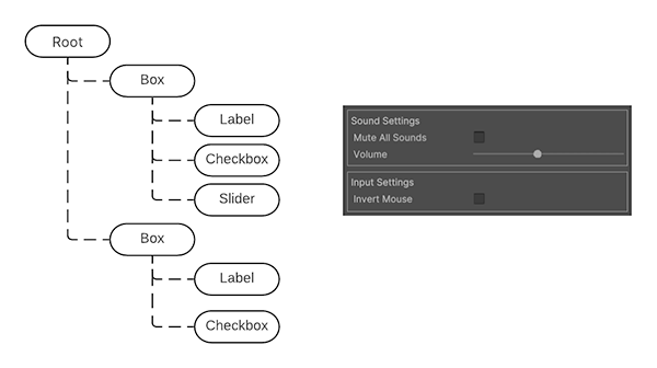
The diagram below displays a simplified example of the visual tree, and the rendered result in UI Toolkit.

The VisualElement class is the base for all nodes in the visual tree. The VisualElement base class contains properties such as styles, layout data, and event handlers. Visual elements can have children and descendant visual elements. For example, in the diagram above, the first Box visual element has three child visual elements: Label, Checkbox, and Slider.
You can customize the appearance of visual elements through inline styles and stylesheets. You can also use event callbacks to modify the behavior of a visual element.
VisualElement derives into subclasses that define additional behavior and functionality, such as controls. UI Toolkit includes a variety of built-in controls with specialized behavior. For example, the following items are available as built-in controls:
You can also combine visual elements together and modify their behavior to create custom controls.