- Unity User Manual 2022.2
- Create user interfaces (UI)
- UI 工具包
- Style UI
- USS properties
- USS common properties
USS common properties
This page introduces the common USS properties, their syntax and accepted values, and differences from CSS. For a complete list of USS properties, see USS properties reference.
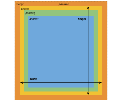
框形模型

尺寸
width: <length> | auto
height: <length> | auto
min-width: <length> | auto
min-height: <length> | auto
max-width: <length> | none
max-height: <length> | none
width 和 height 指定元素的大小。如果未指定 width,则宽度基于元素内容的宽度。如果未指定 height,则高度基于元素内容的高度。
边距
margin-left: <length> | auto;
margin-top: <length> | auto
margin-right: <length> | auto
margin-bottom: <length> | auto
/* Shorthand */
margin: [<length> | auto]{1,4}
边框
border-left-width: <length>
border-top-width: <length>
border-right-width: <length>
border-bottom-width: <length>
/* Shorthand */
border-width: <length>{1,4}
填充
padding-left: <length>
padding-top: <length>
padding-right: <length>
padding-bottom: <length>
/* Shorthand */
padding: <length>{1,4}
Differences from CSS
The alternative box model that USS uses is different from the standard CSS box model. In the standard CSS box model, width and height define the size of the content box. An element’s rendered size is the sum of its padding, border-width, and width / height values.
Unity 的模型相当于将 CSS 的 box-sizing 属性设置为 border-box。有关详细信息,请参阅 MDN 文档。
灵活布局
UI Toolkit includes a layout engine that positions visual elements based on layout and styling properties. The layout engine implements a subset of Flexbox, an HTML/CSS layout system.
默认情况下,所有项都垂直放置在其容器中。
/* Items */
flex-grow: <number>
flex-shrink: <number>
flex-basis: <length> | auto
flex: none | [ <'flex-grow'> <'flex-shrink'>? || <'flex-basis'> ]
align-self: auto | flex-start | flex-end | center | stretch

/* Containers */
flex-direction: row | row-reverse | column | column-reverse
flex-wrap: nowrap | wrap | wrap-reverse
align-content: flex-start | flex-end | center | stretch

/* The default value is `stretch`.
`auto` sets `align-items` to `flex-end`. */
align-items: auto | flex-start | flex-end | center | stretch

justify-content: flex-start | flex-end | center | space-between | space-around
Positioning
/* The default value is `relative` which positions the element based on its parent.
If sets to `absolute`, the element leaves its parent layout and values are specified based on the parent bounds.*/
position: absolute | relative

/* The distance from the parent edge or the original position of the element. */
left: <length> | auto
top: <length> | auto
right: <length> | auto
bottom: <length> | auto
背景
background-color: <color>
background-image: <resource> | <url> | none
-unity-background-scale-mode: stretch-to-fill | scale-and-crop | scale-to-fit
-unity-background-image-tint-color: <color>
Slicing
When assigning a background image, you draw it with respect to a simplified 9-slice specification:
-unity-slice-left: <integer>
-unity-slice-top: <integer>
-unity-slice-right: <integer>
-unity-slice-bottom: <integer>
-unity-slice-scale: <length>
Border color
border-color: <color>
Border radius
border-top-left-radius: <length>
border-top-right-radius: <length>
border-bottom-left-radius: <length>
border-bottom-right-radius: <length>
/* Shorthand */
border-radius: <length>{1,4}
Differences from CSS
Border radius properties work almost the same in USS and CSS. For detailed information about border-radius, see the MDN documentation.
However, there are two main differences:
- Unity doesn’t support the second-radius shorthand (
border-radius: (first radius values) / (second radius values);) used to create elliptical corners. - Unity reduces border radius values to half of the element’s size in pixels. For example, for a 100px x 100px element, any
border-radiusvalue greater than 50px is reduced to 50px. If you use percentage (%) values for border radius properties, Unity first resolves the percentage to pixels and then reduces theborder-radiusvalue to half of the resolved pixel value. If you have different radius values for two or more corners, Unity reduces any values greater than half of the element’s size to half of the element’s size.
Appearance
overflow: hidden | visible
-unity-overflow-clip-box: padding-box | content-box
-unity-paragraph-spacing: <length>
opacity: <number>
visibility: visible | hidden
display: flex | none
-unity-overflow-clip-box 定义元素内容的裁剪矩形。默认值为 padding-box,表示位于填充区域外部的矩形(上文的框形模型图像中的绿色矩形);content-box 表示位于填充区域内的值(上文的框形模型图像中的蓝色矩形)。
The display default value is flex. Setting display to none removes the element. Setting the visibility to hidden hides the element, but the element still occupies space in the layout.
Differences from CSS
USS display 属性只支持 CSS display 属性可用关键字值的一小部分。USS 版本支持与 Yoga 布局引擎配合使用的关键词。
- For more information about Yoga, see Flexible Layouts with Yoga.
- 有关 CSS
display属性的更多信息,请参阅 MDN 文档。
文本属性
文本属性用于设置颜色、字体、字体大小以及 Unity 特有属性(字体资源、字形、对齐、自动换行和剪切)。
color: <color>
-unity-font: <resource> | <url>
-unity-font-definition: <resource> | <url>
font-size: <number>
-unity-font-style: normal | italic | bold | bold-and-italic
-unity-text-align: upper-left | middle-left | lower-left | upper-center | middle-center | lower-center | upper-right | middle-right | lower-right
-unity-text-overflow-position: start | middle | end
white-space: normal | nowrap

-unity-text-outline-width: <length>
-unity-text-outline-color: <color>
/* Shorthand */
-unity-text-outline: <length> | <color>
Note: When setting up font in UI Builder, the Font control in the Inspector sets -unity-font, and the Font Asset control sets -unity-font-definition. Because -unity-font-definition takes precedence over -unity-font, if you want to use a font from the Font list, you must select None from Font Asset. Otherwise, the font you selected won’t take effect.
Cursor
The cursor property specifies the mouse cursor to be displayed when the mouse pointer is over an element.
cursor: [ [ <resource> | <url> ] [ <integer> <integer>]?, ] [ arrow | text | resize-vertical | resize-horizontal | link | slide-arrow | resize-up-right | resize-up-left | move-arrow | rotate-arrow | scale-arrow | arrow-plus | arrow-minus | pan | orbit | zoom | fps | split-resize-up-down | split-resize-left-right ]
Note: Cursor keywords are only available in the Editor UI. Cursor keywords do not work in runtime UI. In runtime UI, you must use a texture for custom cursors.
Differences from CSS
在 CSS 中,您可以在单个 cursor 样式声明中指定多个可选的自定义光标和一个强制关键字。当您指定多个光标时,它们会形成一个回退链。如果浏览器无法加载第一个自定义光标,它会依次尝试其他每个光标,直到能加载其中一个或没有更多自定义光标可供尝试。如果浏览器无法加载任何自定义光标,则它使用关键字。
在 USS 中,自定义光标和关键字是互斥的。一个 cursor 样式声明只能有一个自定义光标或一个关键字。
有关 CSS cursor 属性的详细信息,请参阅 MDN 文档。
Opacity
opacity: <number>
Differences from CSS
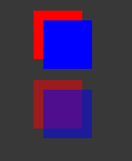
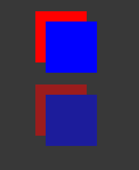
USS opacity is similar to CSS opacity. The opacity of parent elements affects the perceived opacity of child elements. The perceivability is different between USS opacity and CSS opacity.
In the following USS example, the blue square is a child of the red square. The red square has an opacity of 0.5.
.red {
    background-color: red;
    opacity: 0.5;
}

.blue {
    background-color: blue;
    left: 20px;
    top: 20px;
}
Although the blue square doesn’t have an opacity value, it has a perceived opacity of 0.5 from the red square. You can see the red square through the blue square.

In CSS, if you apply the same styles, both the red and blue squares are 50% transparent. However, you can’t see the red square through the blue square, unless you also set the opacity of blue to be less than 1.
