Unity Manual
- Unity 6 Preview User Manual
- What's new in Unity
- Packages and feature sets
- Released packages
- 2D Animation
- 2D Aseprite Importer
- 2D Pixel Perfect
- 2D PSD Importer
- 2D SpriteShape
- 2D Tilemap Extras
- Adaptive Performance
- Addressables
- Addressables for Android
- Ads Mediation
- Advertisement Legacy
- AI Navigation
- Alembic
- Analytics
- Android Logcat
- Animation Rigging
- Apple ARKit XR Plugin
- AR Foundation
- Authentication
- Build Automation
- Burst
- CCD Management
- Cinemachine
- Cloud Code
- Cloud Diagnostics
- Cloud Save
- Code Coverage
- Collections
- Dedicated Server
- Deployment
- Device Simulator Devices
- Economy
- Editor Coroutines
- Entities
- Entities Graphics
- FBX Exporter
- Friends
- Google ARCore XR Plugin
- Havok Physics for Unity
- In App Purchasing
- Input System
- iOS 14 Advertising Support
- JetBrains Rider Editor
- Leaderboards
- Live Capture
- Lobby
- Localization
- Magic Leap XR Plugin
- Matchmaker
- Mathematics
- Memory Profiler
- Microsoft GDK API
- Microsoft GDK Tools
- ML Agents
- Mobile Notifications
- Multiplay
- Multiplayer Play Mode
- Multiplayer Tools
- Muse Sprite Tool
- Muse Texture Tool
- Netcode for Entities
- Netcode for GameObjects
- Oculus XR Plugin
- OpenXR Plugin
- Performance testing API
- Player Accounts
- Polybrush
- Post Processing
- ProBuilder
- Profile Analyzer
- Push Notifications
- Python Scripting
- Recorder
- Relay
- Remote Config
- Scriptable Build Pipeline
- Sequences
- Services Tooling
- SharpZipLib
- Splines
- Sysroot Base
- Sysroot Linux x64
- System Metrics Mali
- Terrain Tools
- Test Framework
- Timeline
- Toolchain Linux x64
- Toolchain MacOS Arm64 Linux x64
- Toolchain MacOS Linux x64
- Toolchain Win Linux x64
- Toolchain WinArm64 Linux x64
- Tutorial Authoring Tools
- Tutorial Framework
- Unity Logging
- Unity OpenXR Meta
- Unity Physics
- Unity Profiling Core API
- Unity Transport
- User Generated Content
- User Generated Content Bridge
- User Reporting
- Version Control
- Visual Scripting
- Visual Studio Editor
- Vivox
- WebGL Publisher
- XR Hands
- XR Interaction Toolkit
- XR Plugin Management
- ZivaRT Player
- Release candidates
- Pre-release packages
- Core packages
- Built-in packages
- Accessibility
- AI
- AMD
- Android JNI
- Animation
- Asset Bundle
- Audio
- Cloth
- Director
- Image Conversion
- IMGUI
- JSONSerialize
- NVIDIA
- Particle System
- Physics
- Physics 2D
- Screen Capture
- Terrain
- Terrain Physics
- Tilemap
- UI
- UIElements
- Umbra
- Unity Analytics
- Unity Web Request
- Unity Web Request Asset Bundle
- Unity Web Request Audio
- Unity Web Request Texture
- Unity Web Request WWW
- Vehicles
- Video
- VR
- Wind
- XR
- Experimental packages
- Packages by keywords
- Unity's Package Manager
- How Unity works with packages
- Concepts
- Configuration
- Package Manager window
- Access the Package Manager window
- Navigation panel
- List panel
- Details panel
- Features (details panel)
- Finding packages and feature sets
- Add and remove UPM packages or feature sets
- Install a feature set from the Unity registry
- Install a UPM package from a registry
- Install a UPM package from the Asset Store
- Install a UPM package from a local folder
- Install a UPM package from a local tarball file
- Install a UPM package from a Git URL
- Install a UPM package by name
- Remove a UPM package from a project
- Switch to another version of a UPM package
- Add and remove asset packages
- Disable a built-in package
- Perform an action on multiple packages
- Finding package documentation
- Inspecting packages
- Scripting API for packages
- Scoped registries
- Resolution and conflict
- Project manifest
- Troubleshooting
- Creating custom packages
- Feature sets
- Released packages
- Install Unity
- System requirements for Unity 6 Preview
- Install Unity from the command line
- Install Unity offline without the Hub
- Deploy Unity across your enterprise
- Enable Unity installation by standard users (Windows)
- Use Unity through web proxies
- Enable automatic proxy configuration
- Store credentials for automatic proxy configuration (Windows)
- Store credentials for automatic proxy configuration (macOS)
- Trusting the web proxy security certificate
- Use environment variables to identify your web proxy
- Create a command file to set environment variables and open applications
- Define exceptions on your web proxy
- Licenses and activation
- Upgrade Unity
- Create with Unity
- 2D or 3D projects
- Unity's interface
- The Project window
- The Scene view
- The Game view
- Device Simulator
- The Hierarchy window
- The Inspector window
- Editing properties
- The Toolbar
- The status bar
- The Background Tasks window
- Console Window
- Additional windows
- Undo
- Search in the Editor
- Customizing your workspace
- Unity shortcuts
- Quickstart guides
- Advanced best practice guides
- Create Gameplay
- Editor Features
- Analysis
- Memory in Unity
- Profiler overview
- Profiling your application
- Common Profiler markers
- The Profiler window
- Asset Loading Profiler module
- Audio Profiler module
- CPU Usage Profiler module
- File Access Profiler module
- Global Illumination Profiler module
- GPU Usage Profiler module
- Highlights Profiler Module
- Memory Profiler module
- Physics Profiler module
- Physics 2D Profiler module
- Rendering Profiler module
- UI and UI Details Profiler
- Video Profiler module
- Virtual Texturing Profiler module
- Customizing the Profiler
- Low-level native plug-in Profiler API
- Profiling tools
- Log files
- Understanding optimization in Unity
- Asset loading metrics
- Asset workflow
- Input
- 2D game development
- Introduction to 2D
- 2D game development quickstart guide
- 2D Sorting
- Work with sprites
- Tilemaps
- Essential tilemap steps and tools
- Active brush
- Create Tilemaps
- Create tile assets
- Create a Tile Palette
- Tile Palette editor tools
- Using the Select tool
- Move selected tiles with the Move tool
- Paint tiles with the Paint tool
- Use the Box Fill tool to fill an area with duplicated tiles
- Select tiles on the tilemap or Tile Palette with the Pick tool
- Remove tiles from the tilemap with the Eraser tool
- Fill an empty area with tiles with the Flood Fill tool
- Brush Picks
- Tilemap Collider 2D component reference
- Hexagonal Tilemaps
- Isometric Tilemaps
- Scriptable Tiles
- Scriptable Brushes
- Tile Palette visual elements
- Tilemap component reference
- Grid component reference
- Tilemap Renderer component reference
- Tile asset reference
- Tile Palette preferences reference
- Tile Palette editor reference
- Brush Inspector window reference
- Essential tilemap steps and tools
- Physics 2D Reference
- Graphics
- Render pipelines
- Render pipelines introduction
- Render pipeline feature comparison
- How to get, set, and configure the active render pipeline
- Choosing and configuring a render pipeline and lighting solution
- Using the Built-in Render Pipeline
- Using the Universal Render Pipeline
- Using the High Definition Render Pipeline
- Scriptable Render Pipeline fundamentals
- Creating a custom render pipeline
- Cameras
- Lighting
- Introduction to lighting
- Light sources
- Shadows
- The Lighting window
- Lighting Settings Asset
- The Light Explorer window
- Lightmapping
- Realtime Global Illumination using Enlighten
- Light Probes
- Reflection Probes
- Precomputed lighting data
- Debug Draw Modes for lighting
- Models
- Meshes
- Textures
- Importing Textures
- Texture Import Settings
- Default Import Settings reference
- Normal map Import Settings reference
- Editor GUI and Legacy GUI Import Settings reference
- Sprite (2D and UI) Import Settings reference
- Cursor Import Settings reference
- Cookie Import Settings reference
- Lightmap Import Settings reference
- Directional Lightmap Import Settings reference
- Shadowmask Import Settings reference
- Single Channel Import Settings reference
- Texture Import Settings
- Texture formats
- Mipmaps
- Render Texture
- Custom Render Textures
- Movie Textures
- 3D textures
- Texture arrays
- Cubemaps
- Cubemap arrays
- Streaming Virtual Texturing
- Streaming Virtual Texturing requirements and compatibility
- How Streaming Virtual Texturing works
- Enabling Streaming Virtual Texturing in your project
- Using Streaming Virtual Texturing in Shader Graph
- Cache Management for Virtual Texturing
- Marking textures as "Virtual Texturing Only"
- Virtual Texturing error material
- Sparse Textures
- Loading texture and mesh data
- Importing Textures
- Shaders
- Shaders core concepts
- Built-in shaders
- Standard Shader
- Standard Particle Shaders
- Autodesk Interactive shader
- Legacy Shaders
- Using Shader Graph
- Writing shaders
- Writing shaders overview
- ShaderLab
- ShaderLab: defining a Shader object
- ShaderLab: defining a SubShader
- ShaderLab: defining a Pass
- ShaderLab: adding shader programs
- ShaderLab: specifying package requirements
- ShaderLab: commands
- ShaderLab: grouping commands with the Category block
- ShaderLab command: AlphaToMask
- ShaderLab command: Blend
- ShaderLab command: BlendOp
- ShaderLab command: ColorMask
- ShaderLab command: Conservative
- ShaderLab command: Cull
- ShaderLab command: Offset
- ShaderLab command: Stencil
- ShaderLab command: UsePass
- ShaderLab command: GrabPass
- ShaderLab command: ZClip
- ShaderLab command: ZTest
- ShaderLab command: ZWrite
- ShaderLab legacy functionality
- HLSL in Unity
- Preprocessor directives in HLSL
- Shader semantics
- Accessing shader properties in Cg/HLSL
- Providing vertex data to vertex programs
- Built-in shader include files
- Built-in macros
- Built-in shader helper functions
- Built-in shader variables
- Shader data types and precision
- Using sampler states
- GLSL in Unity
- Example shaders
- Writing Surface Shaders
- Writing shaders for different graphics APIs
- Understanding shader performance
- Materials
- Visual effects
- Post-processing and full-screen effects
- Particle systems
- Choosing your particle system solution
- Built-in Particle System
- Using the Built-in Particle System
- Particle System vertex streams and Standard Shader support
- Particle System GPU Instancing
- Particle System C# Job System integration
- Components and Modules
- Particle System
- Particle System modules
- Main module
- Emission module
- Shape module
- Velocity over Lifetime module
- Noise module
- Limit Velocity over Lifetime module
- Inherit Velocity module
- Lifetime by Emitter Speed module
- Force over Lifetime module
- Color over Lifetime module
- Color by Speed module
- Size over Lifetime module
- Size by Speed module
- Rotation over Lifetime module
- Rotation by Speed module
- External Forces module
- Collision module
- Triggers module
- Sub Emitters module
- Texture Sheet Animation module
- Lights module
- Trails module
- Custom Data module
- Renderer module
- Particle System Force Field
- Visual Effect Graph
- Decals and projectors
- Lens flares and halos
- Lines, trails, and billboards
- Sky
- Color
- Graphics API support
- Graphics performance and profiling
- Render pipelines
- World building
- Physics
- Built-in 3D Physics
- Character control
- Rigidbody physics
- Collision
- Joints
- Articulations
- Ragdoll physics
- Cloth
- Multi-scene physics
- Physics Debug window reference
- Built-in 3D Physics
- Scripting
- Get started
- Unity scripting fundamentals
- Code reload in the Unity Editor
- Split tasks across frames or threads
- Scripting backends
- Script compilation
- Script serialization
- Plug-ins
- Unity Properties
- UnityWebRequest
- Multiplayer
- Audio
- Audio overview
- Audio files
- Tracker Modules
- Audio Mixer
- Native audio plug-in SDK
- Audio playlist randomization
- Audio Profiler
- Ambisonic Audio
- Audio Reference
- Audio Clip
- Audio Listener
- Audio Source
- Audio Mixer
- Audio Filters
- Audio Effects
- Audio Low Pass Effect
- Audio High Pass Effect
- Audio Echo Effect
- Audio Flange Effect
- Audio Distortion Effect
- Audio Normalize Effect
- Audio Parametric Equalizer Effect
- Audio Pitch Shifter Effect
- Audio Chorus Effect
- Audio Compressor Effect
- Audio SFX Reverb Effect
- Audio Low Pass Simple Effect
- Audio High Pass Simple Effect
- Reverb Zones
- Microphone
- Audio Settings
- Video overview
- Animation
- Animation system overview
- Rotation in animations
- Animation Clips
- Animator Controllers
- Retargeting of Humanoid animations
- Performance and optimization
- Animation Reference
- Animation FAQ
- Playables API
- A Glossary of animation terms
- Legacy Animation system
- User interface (UI)
- Comparison of UI systems in Unity
- UI Toolkit
- Get started with UI Toolkit
- UI Builder
- Structure UI
- The visual tree
- Structure UI with UXML
- Structure UI with C# scripts
- Custom controls
- Best practices for managing elements
- Encapsulate UXML documents with logic
- UXML elements reference
- UXML element BindableElement
- UXML element VisualElement
- UXML element BoundsField
- UXML element BoundsIntField
- UXML element Box
- UXML element Button
- UXML element ColorField
- UXML element CurveField
- UXML element DoubleField
- UXML element DropdownField
- UXML element EnumField
- UXML element EnumFlagsField
- UXML element FloatField
- UXML element Foldout
- UXML element GradientField
- UXML element GroupBox
- UXML element Hash128Field
- UXML element HelpBox
- UXML element IMGUIContainer
- UXML element Image
- UXML element InspectorElement
- UXML element IntegerField
- UXML element Label
- UXML element LayerField
- UXML element LayerMaskField
- UXML element LongField
- UXML element ListView
- UXML element MaskField
- UXML element MinMaxSlider
- UXML element MultiColumnListView
- UXML element MultiColumnTreeView
- UXML element ObjectField
- UXML element PopupWindow
- UXML element ProgressBar
- UXML element PropertyField
- UXML element RadioButton
- UXML element RadioButtonGroup
- UXML element RectField
- UXML element RectIntField
- UXML element RepeatButton
- UXML element RenderingLayerMaskField
- UXML element ScrollView
- UXML element Scroller
- UXML element Slider
- UXML element SliderInt
- UXML element Tab
- UXML element TabView
- UXML element TagField
- UXML element TextElement
- UXML element TextField
- UXML element TemplateContainer
- UXML element Toggle
- UXML element ToggleButtonGroup
- UXML element Toolbar
- UXML element ToolbarBreadcrumbs
- UXML element ToolbarButton
- UXML element ToolbarMenu
- UXML element ToolbarPopupSearchField
- UXML element ToolbarSearchField
- UXML element ToolbarSpacer
- UXML element ToolbarToggle
- UXML element TreeView
- UXML element TwoPaneSplitView
- UXML element UnsignedLongField
- UXML element UnsignedIntegerField
- UXML element Vector2Field
- UXML element Vector2IntField
- UXML element Vector3Field
- UXML element Vector3IntField
- UXML element Vector4Field
- Structure UI examples
- Create list and tree views
- Create a complex list view
- Create a list view runtime UI
- Wrap content inside a scroll view
- Create a tabbed menu
- Create a pop-up window
- Use Toggle to create a conditional UI
- Create a custom control with two attributes
- Create a slide toggle custom control
- Create a bindable custom control
- Create a custom style for a custom control
- Create a drag-and-drop list and tree views between windows
- Create an aspect ratio custom control
- Style UI
- UI Toolkit Debugger
- Control behavior with events
- UI Renderer
- Data binding
- Comparison of the binding systems
- Runtime data binding
- SerializedObject data binding
- Introduction to SerializedObject data binding
- Bindable elements reference
- Bindable data types and fields
- Binding system implementation details
- Binding examples
- Bind with binding path in C# script
- Bind without the binding path
- Bind with UXML and C# script
- Create a binding with the Inspector
- Bind to nested properties
- Bind to a UXML template
- Receive callbacks when a bound property changes
- Receive callbacks when any bound properties change
- Bind to a list with ListView
- Bind to a list without ListView
- Bind a custom control
- Bind a custom control to custom data type
- Support for Editor UI
- Support for runtime UI
- Work with text
- Examples
- Migration guides
- Unity UI
- Immediate Mode GUI (IMGUI)
- Unity Services
- Setting up your project for Unity services
- Unity Organizations
- Unity Ads
- Unity Analytics
- Unity Cloud Content Delivery
- Unity Build Automation (formerly Cloud Build)
- Unity IAP
- Setting up Unity IAP
- Cross Platform Guide
- Codeless IAP
- Defining products
- Subscription Product support
- Initialization
- Browsing Product Metadata
- Initiating Purchases
- Processing Purchases
- Handling purchase failures
- Restoring Transactions
- Purchase Receipts
- Receipt validation
- Store Extensions
- Cross-store installation issues with Android in-app purchase stores
- Store Guides
- Implementing a Store
- Unity Cloud Diagnostics
- Unity Integrations
- Multiplayer Services
- Unity Distribution Portal
- Unity Accelerator
- XR
- Unity's Asset Store
- Asset Store packages
- Publish to the Asset Store
- Creating your Publisher Account
- Creating a new package draft
- Deleting a package draft
- Uploading assets to your package
- Filling in the package details
- Submitting your package for approval
- Viewing the status of your Asset Store submissions
- Collecting revenue
- Providing support to your customers
- Adding tags to published packages
- Connecting your account to Google Analytics
- Promoting your Assets
- Refunding your customers
- Upgrading packages
- Deprecating your Assets
- Issuing vouchers
- Managing your publishing team
- Asset Store Publisher portal
- Verified Solutions
- Platform development
- Using Unity as a Library in other applications
- Deep linking
- Xcode frame debugger Unity integration
- Build path requirements for target platforms
- Android
- Introducing Android
- Getting started with Android
- Developing for Android
- Android mobile scripting
- Input for Android devices
- Android application size restrictions
- Graphics for Android
- Testing and debugging
- Optimization for Android
- Create and use plug-ins in Android
- Integrating Unity into Android applications
- Android application entry points
- Deep linking on Android
- Device features and permissions
- Handle Android crashes
- Quit a Unity Android application
- Building and delivering for Android
- Dedicated Server
- iOS
- Introducing iOS
- Getting started with iOS
- Developing for iOS
- iOS Scripting
- Input for iOS devices
- Unity's Device Simulator for iOS
- Unity Remote
- Managed stack traces on iOS
- Optimize performance for iOS
- Native plug-ins for iOS
- Integrating Unity into native iOS applications
- Deep linking on iOS
- iOS authorizations in Unity
- Prepare your application for in-app purchases
- Social API
- Troubleshooting on iOS devices
- Reporting crash bugs for iOS
- Building and delivering for iOS
- Linux
- macOS
- tvOS
- visionOS
- Web
- Web introduction
- Web development
- Web Player settings
- Interaction with browser scripting
- Code examples: Call JavaScript and C/C++/C# functions in Unity
- Set up your JavaScript plug-in
- Call JavaScript functions from Unity C# scripts
- Call Unity C# script functions from JavaScript
- Call C/C++/C# functions from Unity C# scripts
- Compile a static library as a Unity plug-in
- Create callbacks between Unity C#, JavaScript, and C/C++/C# code
- Replace deprecated browser interaction code
- Web native plug-ins for Emscripten
- Memory in Unity Web
- Cache behavior in Web
- Web graphics
- Audio in Web
- Video playback in Web
- Texture compression in Web
- Embedded resources in Web
- WebAssembly 2023
- Web performance considerations
- Debug and troubleshoot Web builds
- Build and distribute a Web application
- Web Build Settings
- Build your Web application
- Optimize your Web build
- Recommended Graphics settings to optimize your Web build
- Recommended Player settings to optimize your Web build
- Recommended Quality settings to optimize your Web build
- Use C# code to enable optimization settings
- Optimize Web platform for mobile
- Web templates
- Deploy a Web application
- Server configuration code samples
- Windows
- Universal Windows Platform
- Introduction to Universal Windows Platform
- Get started with Universal Windows Platform
- Develop for Universal Windows Platform
- Build and deliver for Universal Windows Platform
- Unity Search
- Glossary
- User interface (UI)
- UI Toolkit
- UI Builder
- Get started with UI Builder
Get started with UI Builder
Want to learn how to create UI(User Interface) Allows a user to interact with your application. Unity currently supports three UI systems. More info
See in Glossary with UI Builder? Use this example to get started.
To create UI in the UI Builder:
- Create a new UI Document (UXML).
- Add elements to create your UI hierarchy.
- Set up attributes and style properties in the InspectorA Unity window that displays information about the currently selected GameObject, asset or project settings, allowing you to inspect and edit the values. More info
See in Glossary. - When more than one element starts to need the same style properties, create USS style sheets and selectors.
- Test your UI and if you are satisfied with the results, extract inline style properties to USS classes.
- Save the UI Document (UXML).
Prerequisites
Before you start, get familiar with the following:
- Introduction to visual elements and visual tree
- Introduction to UXML
- Introduction to USS
- UI Builder interface overview
Example overview
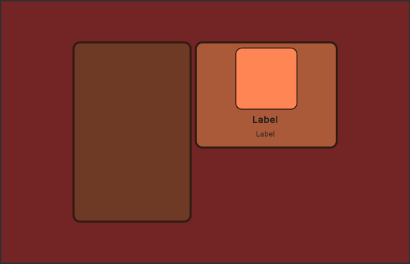
This example creates the main view for the Create a list view runtime UI example. It creates a root element as the background, with two containers. One container holds the character name list and another holds the character details. In the character details container, you add background and foreground frames. Finally, you add two labels for the character name. This example won’t create the character name list entry UI.
Create the root element
Create a new project and then create a root visual elementA node of a visual tree that instantiates or derives from the C# VisualElement class. You can style the look, define the behaviour, and display it on screen as part of the UI. More info
See in Glossary that covers the entire screen. Set your root element to have a background color and center all child elements in the middle of the screen.
Create a project in Unity with any template.
Select Window > UI Toolkit > UI Builder.
-
In the UI Builder window, at the top left of the Viewport window, select File > New to create a new UXML document.
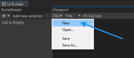
UI Builder file menu Name it as
MainView.uxmland save.-
Drag VisualElement from Library into the Hierarchy panel.
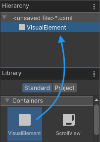
Create new elements by dragging from the Library Tip: You can also double-click a control to add it to the Hierarchy panel.
Select the element from the Hierarchy panel.
-
In the Inspector panel, make sure Flex > Grow is
1. This sets theflex-growproperty to1, making it cover the entire screen.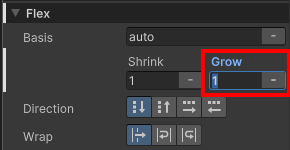
Set the Flex property -
To center all child elements, set both Align Items and Justify Content to
Center.
Center children -
Set Background > Color to
#732526.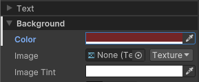
Root element background color
Create the parent container
Create a new VisualElement underneath the root element. This element becomes the parent container for the left and right sections of the UI.
-
Drag VisualElement from Library to the root VisualElement in the Hierarchy panel.
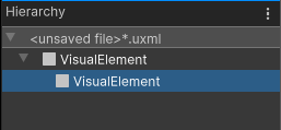
Add a child VisualElement Select the element from the Hierarchy panel.
In the Inspector panel, set Flex > Direction to
row.-
Set Size > Height to
350pixels.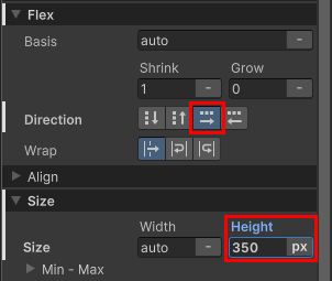
Center container properties
Create the character names list container
Add a ListView as the child element of the container to hold the character names.
Drag a ListView from the Library to the container VisualElement in the Hierarchy panel.
Select the element from the Hierarchy panel.
-
In the Inspector panel, set Name to
CharacterList.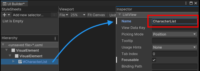
Background container with the empty element inside Set Size > Width to
230pixels.-
Set Spacing > Margin > Right to
6pixels.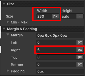
Size and Margin foldouts for the character list Set Background > Color to
#6E3925.Set Border > Color to
#311A11.Set Border > Width to
4pixels.-
Set Border > Radius to
15pixels.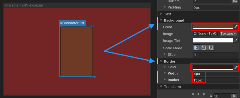
Styled character list
Create the character details container
Add a new VisualElement under the same parent as the #CharacterList to hold the character details container. The purpose is that when the user selects a character from the list on the left, it displays the character’s portrait, name, and class.
Drag a VisualElement from the Library to the container element in the Hierarchy panel. This is the container to hold all the elements on the right.
Select the element from the Hierarchy panel.
In the Inspector panel, set Align > Align Items to
flex-end.-
Set Align > Justify Content to
space-between.
Justify content property Add another VisualElement as the child of the right container.
Select the element from the Hierarchy panel.
Set Size > Width to
276pixels.In the Align section, set both Align Items and Justify Content to
center.-
Set Spacing > Padding to
8pixels.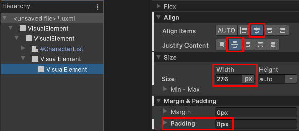
Properties of the character details container Set Background > Color to
#AA5939.Set Border > Color to
#311A11.Set Border > Width to
4pixels.Set Border > Radius to
15pixels.
Your UI layout should now look like the following:
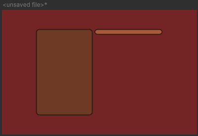
Create the character portrait background
Add the individual UI controls to the character details container. The first step is to add the character portrait background.
Drag VisualElement from Library to the character details container.
Select the element from the Hierarchy panel.
In the Size section, set both Width and Height to
120pixelsThe smallest unit in a computer image. Pixel size depends on your screen resolution. Pixel lighting is calculated at every screen pixel. More info
See in Glossary.Set Spacing > Padding to
4pixels.-
Set Background > Color to
#FF8554.
Background frame for the character portrait
Create a USS class for the border style
The character details container will use the same border styles as the character names list container. Create a USS class to apply to both containers.
- In the StyleSheet panel, select + > Create New USS.
- Name it as
MainView.ussand save. - Click on the Add new selector… field and enter
.border. A.borderselector appears in the StyleSheet panel. - In the StyleSheet panel, select
.border. - In the Inspector panel, set Border > Color to
#311A11. - Set Border > Width to
2pixels. - Set Border > Radius to
15pixels. - Drag
.borderfrom the StyleSheet panel to the character details container VisualElement. - Drag
.borderfrom the StyleSheet panel to the character names list container VisualElement. - Select the character names list container VisualElement.
- In the Inspector panel, right-click Border and select Unset to remove the inline style you set earlier.
Create the character portrait foreground
Next in the character details container is to add the foreground for an actual image.
Drag VisualElement from Library to the character details container.
Select the element from the Hierarchy panel.
Set Name to
CharacterPortrait.Set Flex > Grow to
1, so that the image can use all the available space.-
Set Background > Scale Mode to
scale-to-fit, so that you can scale the image to match the element size while keeping the correct aspect ratio.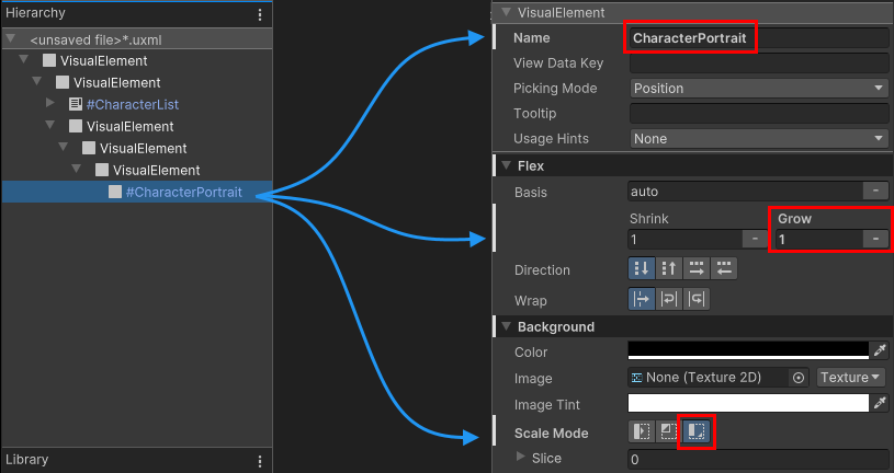
VisualElement for the portrait image
Create labels
Add two label controls to the character details container to display the selected character’s name and class.
Drag Label from Library to the character details container in the Hierarchy panel.
Set
NametoCharacterName.Drag Label from Library to the character details container in the Hierarchy panel.
-
Set
NametoCharacterClass.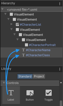
Add labels for name and class Select the
#CharacterNameelement.Set Text > Font Style to
B.-
Set Text > Size to
18pixels.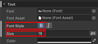
Change font settings In the Viewport window, select File > Save to save the changes to
MainView.uxml.
Extract inline styles
In UI Builder, you can create elements and use inline styles only to experiment while the number of elements is still small. As you build a more complex UI, it’s easier to manage styles using style sheets. You can extract inline styles to a style sheet in UI Builder.
- Select the root visual element.
- In the Inspector panel, in the Style Class List field, enter
.backgroundas the class name. - Select Extract Inlined Styles to New Class. This creates a
.backgroundclass selector with the inline styles you set for the root element and updates the UI Document (UXML) for the root visual element to use the class selector instead of the inline styles. - In the Viewport window, select File > Save.
If you want to continue to work on the Create a list view runtime UI example, you can repeat the steps to extract styles for all the other elements, and follow the instructions to create the example.